K-Means Clustering Animation Reflections

I watched two animations of the k-means clustering algorithm to see how it repeatedly assigns data points to clusters and updates their centroids.
The animations are sourced from:
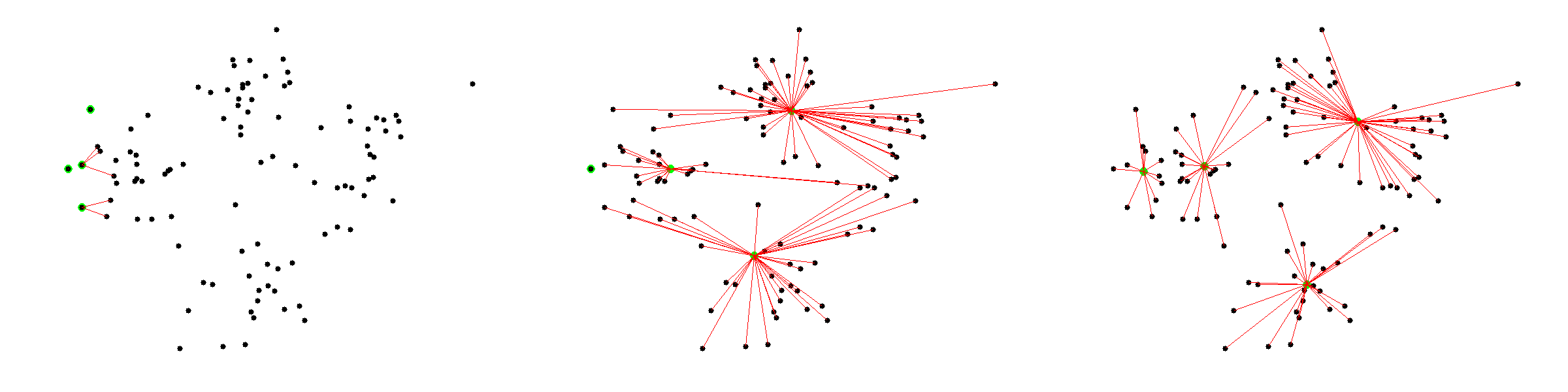
Figure 1. Selected stages from the first animation: initial centroid placement, an intermediate assignment and update step, and the final clusters.
Reflection
Both animations show the iterative process behind k-means:
- choose the number of clusters
- place initial centroids
- assign each point to its nearest centroid
- update each centroid to the mean of its assigned points
- repeat until the clusters stabilise
The first animation shows how the starting position of centroids can strongly affect the early clustering process. Even if the initial placement is poor, the algorithm gradually improves the grouping by repeatedly reassigning points and moving centroids.
The “I’ll choose” and “Uniform Points” options in the second animation show that k-means will still create clusters even when the data may not contain meaningful natural groups. This happens because the algorithm optimises distance and has no understanding of real-world meaning or context. It works best when clusters are relatively compact and well separated, but it can be misleading with uniform, irregular, overlapping, or high-dimensional datasets.
From an ethical perspective, if clustering is used to segment people, such as customers, students, patients, or job applicants, the chosen value of k, dataset features, and assumptions behind the model need to be justified. Otherwise, the algorithm may create artificial categories and lead to decisions that are biased, unfair, or difficult to explain.